Problem Statement
Based on our user research, the research process for the typical watch collector when looking for the average or fair price of a watch involves scrolling through listings and manually averaging out the listing prices.
During our user interviews in which users interacted with WatchCharts, users disregarded the research portion of the website and immediately went to the listings to manually research. We identified the main reasons behind this behavior to be because:
- Users were unaware of this new way of researching using the WatchCharts price guide
- Users trusted their own judgment and research methods
- User habits are hard to break…
Users were unaware of this new way of researching using the WatchCharts price guide.
This unawareness resulted from two main causes:
- Selective Attention: Users are familiar with and therefore focused on their own research methods by manually averaging the listing prices of multiple watches for sale. Therefore they disregarded the research portion of the site and when directly to listings when asked to perform research on a specific watch.
- Inadequate Visual Differentiation: Not only did users lack the mental model of listings vs. models, but also the WatchCharts website was not designed adequately to visually communicate that differentiation through first glance.
Business Objectives
- Introduce the mental model of listings vs. models to users
- Increase site engagement of the price guide through listing pages as the new way of researching
- WatchCharts becomes known as THE secondhand watch market research and discovery tool.
The Solution
Initial State
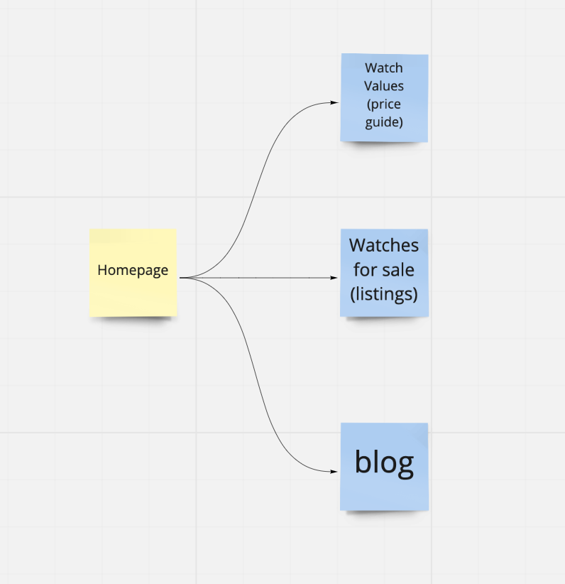
WatchCharts consisted of three main sections:
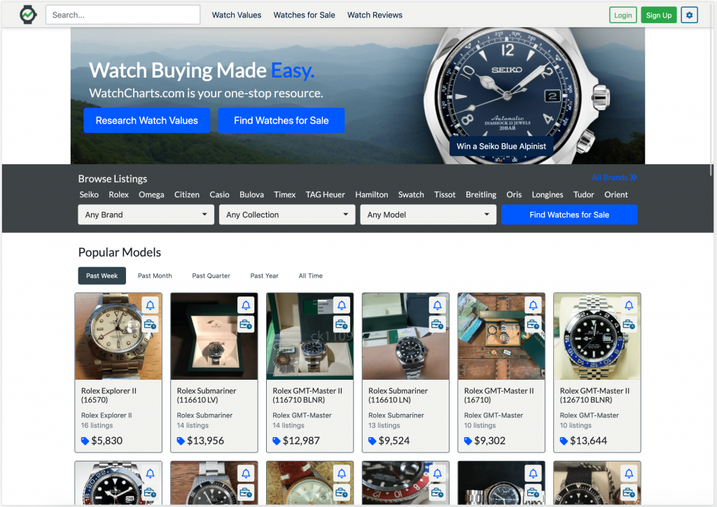
- Watch Values: A price guide in which users can search by watch models to research market prices
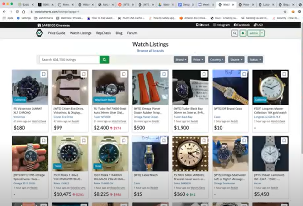
- Watches For Sale: A catalog of watch listings scraped from various watch forums like Reddit, Watch Exchange, and WatchUSeek
- Watch Review: A blog with watch reviews and deals

These sections were separated into three tabs on the navigation bar on the website. However, each tab was distinct from each other with little to no links in which a user could flow from a listing in the Watches For Sale section to a price guide of a watch model in the Watch Values section, and vice versa.
This presented a problem. Based on data from Google Analytics, most WatchCharts users’ first interaction with the site is through a watch listing page, most likely brought through a google search of a specific watch. Our objective was to increase the awareness of the WatchCharts price guide as a new and improved method of researching market prices.
Therefore, a clear path from the listing page to a model page in the price guide must be built in order to increase engagement and exposure of the price guide. To achieve this, we:
- Redesigned the web flow of pages on WatchCharts, emphasizing user flows from a listing page to a model page and vice versa
- Redesigned the listing and model pages to be more visually distinct
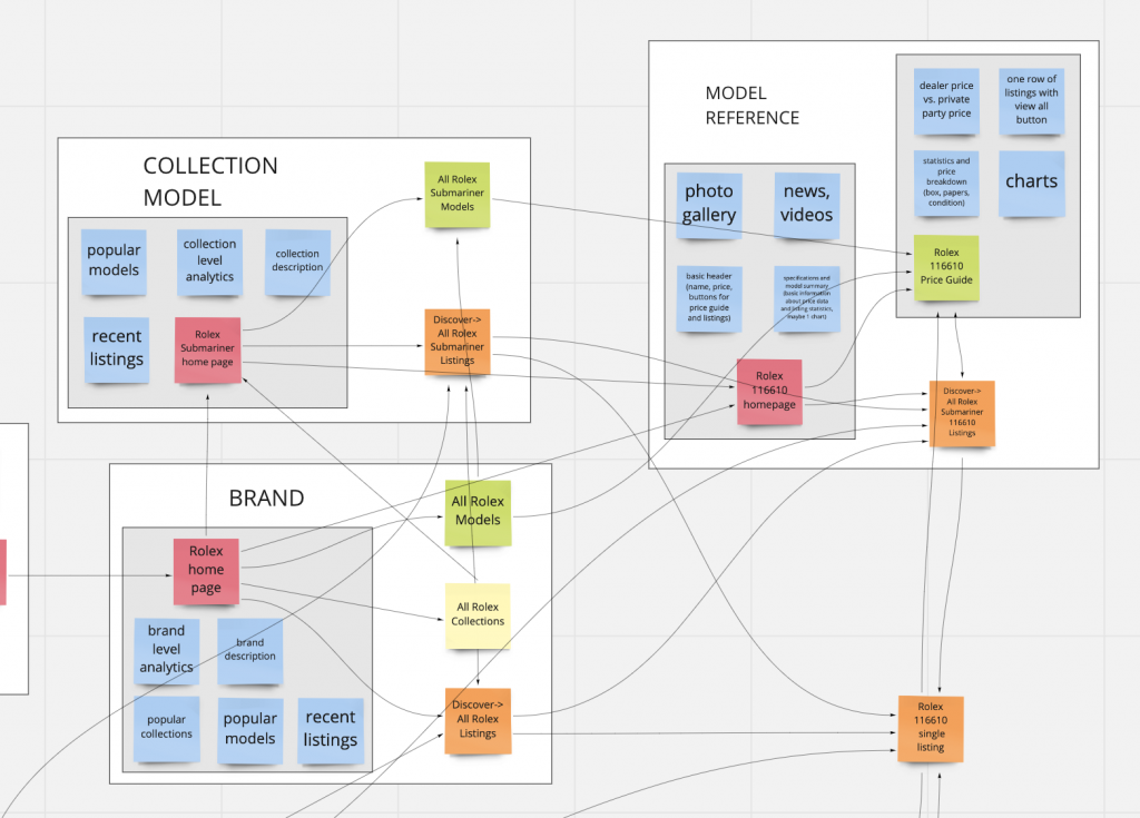
Redesigned State – Web Flow
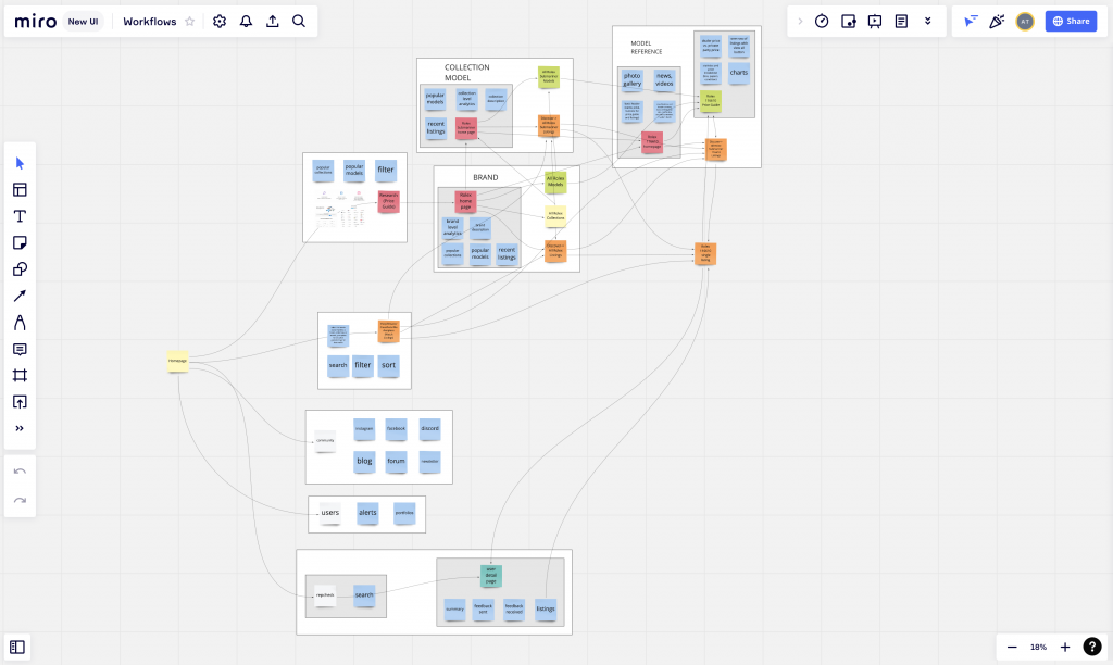
The new WatchCharts web flow focused on three main changes:
1. Redirecting the WatchCharts homepage to the listing page
WatchCharts users were most interested in browsing watch listings. As such, we redirected the homepage to the listing page to remove one step in the user flow that would allow users to browse listings. This change would increase overall engagement with the website to build customer recognition, loyalty, and trust.
2. Enhancing the user flow between watching listings and watch model pages
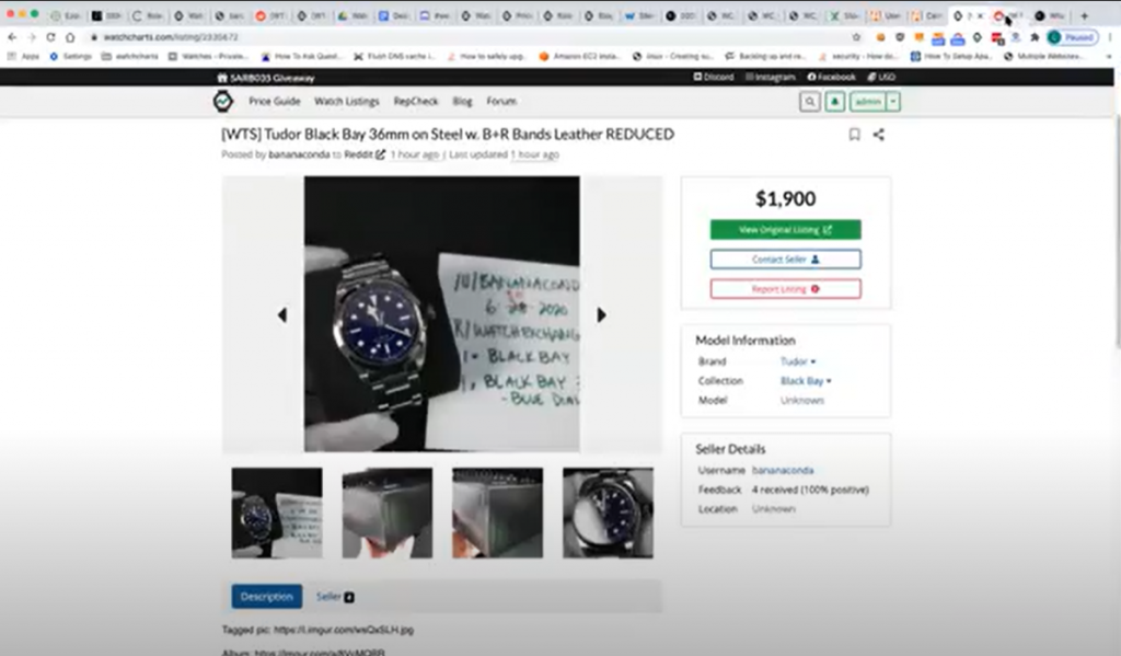
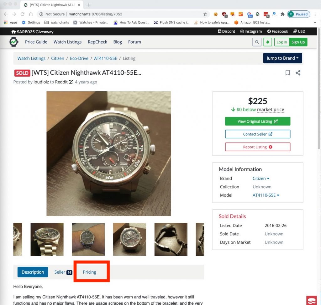
In order to better integrate the user flow between the watch listings and watch model pages, we added links on each that would take users from a watch listing page to a watch model page, and vice versa. More specifically, on the watch listings page, we added a pricing tab with a visual chart of the price guide as well as a link that would bring them to the respective watch model page.
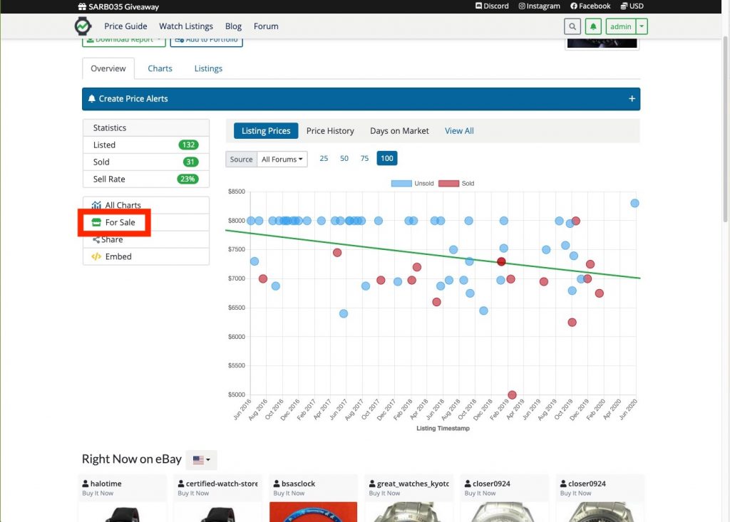
On the watch models page, we added a link for watches “for sale” of this specific watch, which would bring the user to a filtered list of watch listings.
(Since then, we have continued to improve the visual design and UX of both pages. I describe the process of enhancing our model page here)
3. Redesigning the flow of the price guide to integrate a distinction of watch brands (ex. Rolex), collections (ex. Rolex Submariner), and models (ex. Rolex Submariner 116610)
The original price guide primarily relied on the user to search for specific watches using the search box. The UX for this method can be seamless, IF it worked. More specifically, this user experience relied heavily on the user to know what to search, to spell the watch model correctly, and to remember the exact number of the watch model if applicable. In addition, the UX of using the search box depended on the technical backing and algorithms created by the WatchCharts developers to filter the database and display the relevant search results.
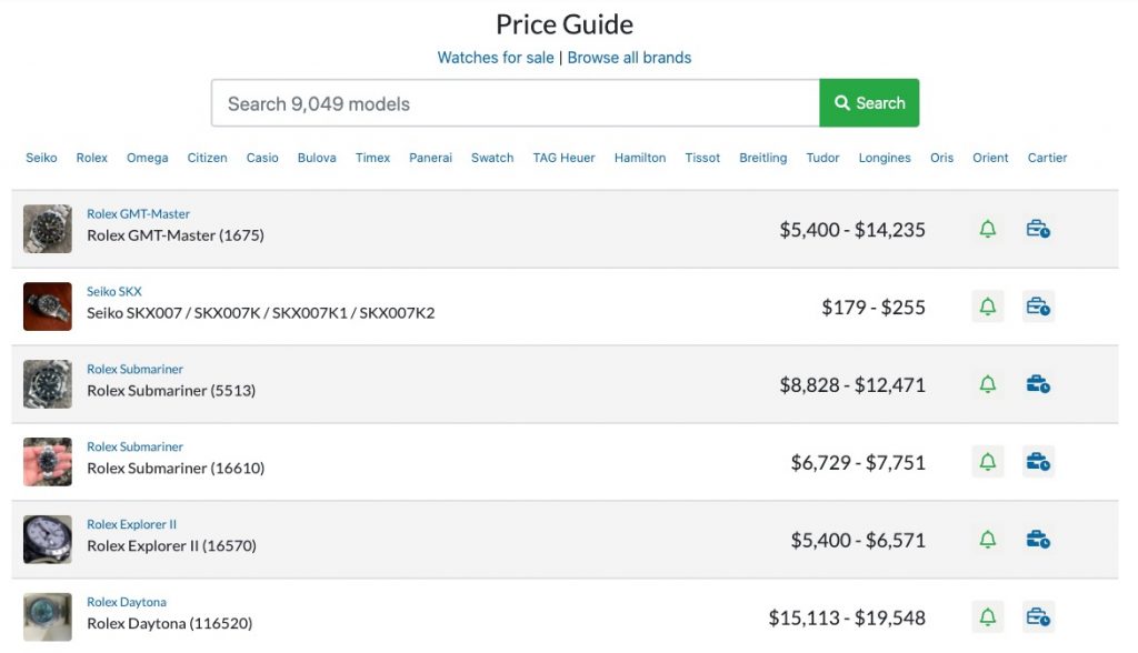
The Redesigned Price Guide
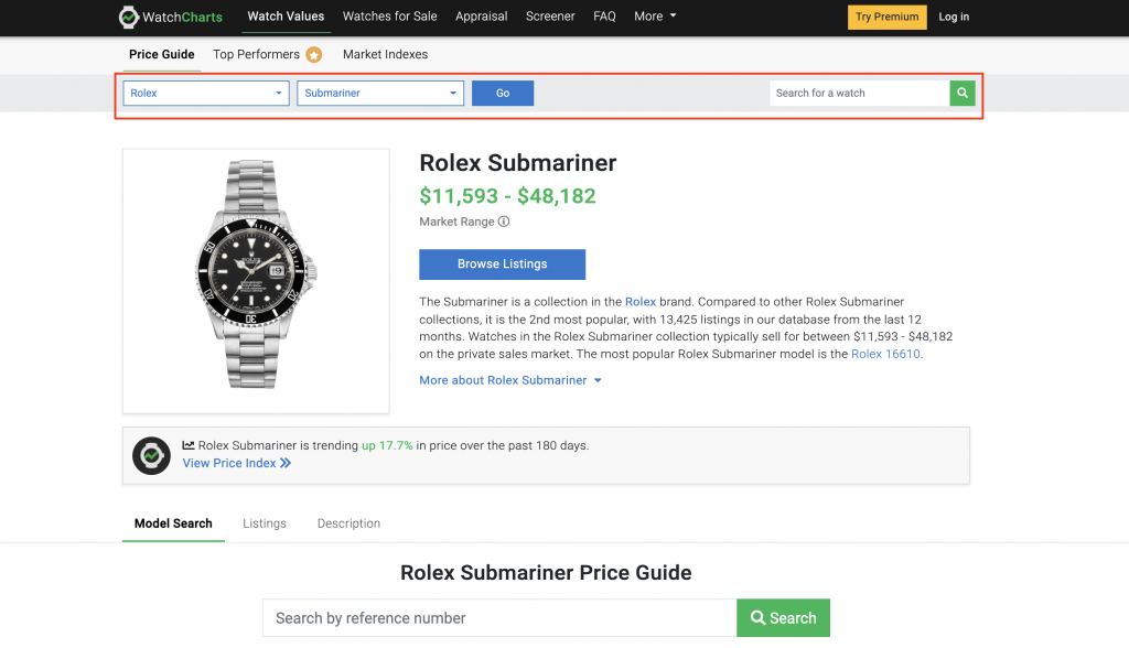
For this redesign, we separated watch brands (ex. Rolex), collections (ex. Rolex Submariner), and models (ex. Rolex Submariner 116610) into their own pages. As a result, the user is not required to know the exact watch model number in order to find that specific watch. The user is able to narrow down his search starting from the watch brand page, to the watch collection page, and then to the watch model page.
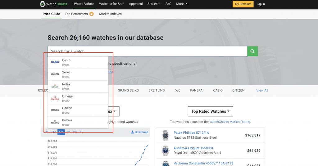
In addition, search box was enhanced to suggest watch brands, collections, and models while the user typed. This further helps the user to search correctly so that they would see results.
To enhance the flow between different watch brands, collections, and models after the first search is committed, drop downs for watch brands and collections were added to each page within the price guide. A search box to search for watch models was also added so users could still search for other watches after entering the price guide.
Conclusion
This new web flow laid the foundation to improve the user experience for WatchCharts users as well as achieve the business objective to increase awareness of the price guide, ultimately to become known as THE secondhand watch market research and discovery tool.
Next Steps
We validated the effectiveness of our redesign through user testing interviews.
Since then, we have also focused on continuously improving the visual design of the price guide as well as add new features that would help users in their research and discovery of watches on the secondary market.