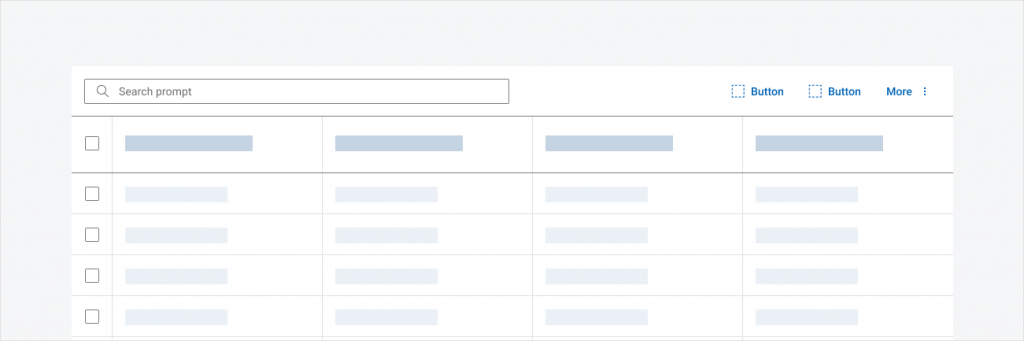
Initial State
Table is one of the most used and important components in the Dell Design System (DDS). Several users have requested an enhancement to the component to allow actions to be performed on a large scale of data.
Research purpose
Many users already have some type of bulk / batch actions on their tables based on business needs. Therefore, I paired with 2 DDS engineers to research how our users were implementing bulk actions in order to understand the breadth of use cases our feature for the design system should cover.
What are the most common bulk actions users need? Should the DDS provide standard implementations of certain actions or should users be in charge of implementation?
discovery
The Process
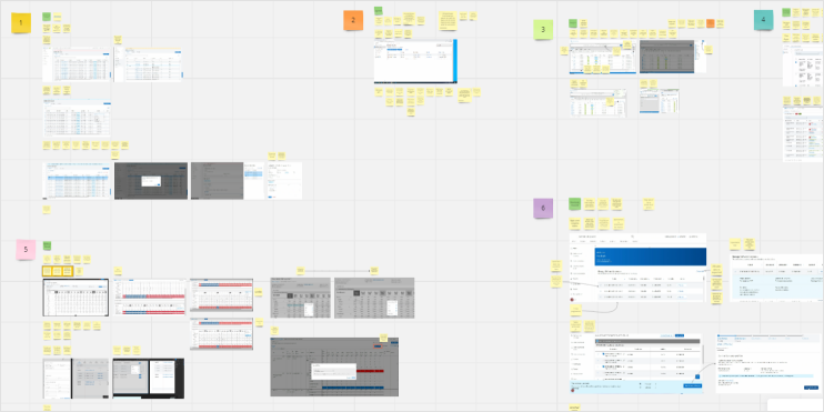
- Time: ~2.5 months
- Team: Myself and 2 Developers
- Role: Designer
- User Interviews: 9 groups of Dell designers / developers
Insights
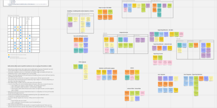
We synthesized the data we gathered from the 9 interviews with designers, engineers, and PMs conducted. These are some of the most important insights we found:
- Bulk actions consist of three use cases: actions performed on a group of selected rows, actions performed on the entire table (without needing to select any row), or actions with both capabilities
- Export is the most used action (9/9 participants), followed by custom actions (6/9 participants), and delete (5/9 participants)
- Some customers faced more challenges implementing their own selectable rows in comparison to implementing bulk actions.
- Most participants currently do not support a mobile version of their application (8/9 participants).
- Bulk delete always includes a pop up confirmation (5/5 participants)
- In terms of user flow, for actions besides delete and export, there are a couple of scenarios:
- users need to click “apply” to apply changes – sort of like confirmation
- users only need to select the action – no confirmation needed
- there are also cases where the bulk action button will take the user to another page or open a drawer
- Bulk actions are most commonly presented as buttons or a dropdown at the top of the table. Sometimes both (quick actions)
- For all table with more than 3 actions, they were done with both a button and a dropdown
- Most tables with only one action just had an export button
- Many tables with only 1-2 actions had other buttons that were not bulk actions (ex. column filter)
- Most tables also had a search bar
Framing
Project Scope and MVP
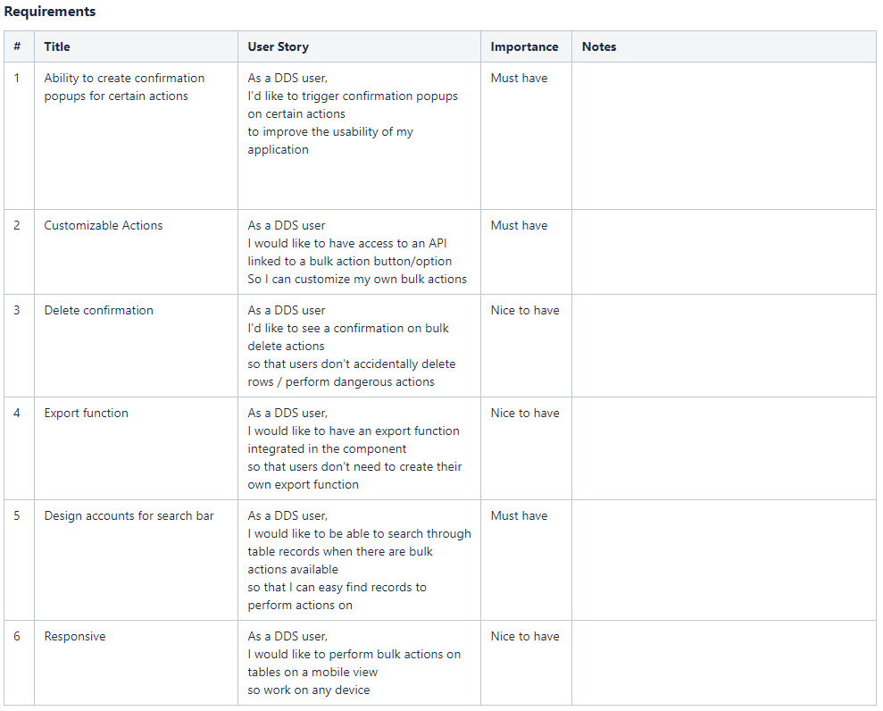
Based on our insights, we came up with a list of requirements that users expressed a need for and prioritized them based on importance. For the scope of this project, we only focused on implementing the “must have” items.
Build
Creating the Figma Component
Using the existing DDS Button component, I created a bulk actions component that allows users to customize the number of bulk actions using the layers panel as well as include an action menu through a boolean property.
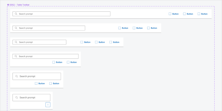
Altering the existing DDS Search bar component, I added the Bulk Action component to this component and renamed it “DDS Table Ribbon.” Including the new component in this way not only makes it easier for users as it is already aligned properly in the table ribbon, but also avoids bloating our UI Kit with too many components.
I also created a Figma prototype to illustrate the behaviors of the bulk actions feature. This was helpful in our handoff process with developers.
Notable Behavior and design decisions:
The bulk actions component was built with flexibility in mind. I wanted to account for the existing implementations of bulk actions shared in our user interviews while considering best practices in terms of accessibility, usability, and content.
- Disabled Buttons: Users can initially enable or disable bulk actions based on the use case (ex. Whether a row should be selected or not to perform the action). This is also more accessible than bulk actions appearing / disappearing based on the use case.
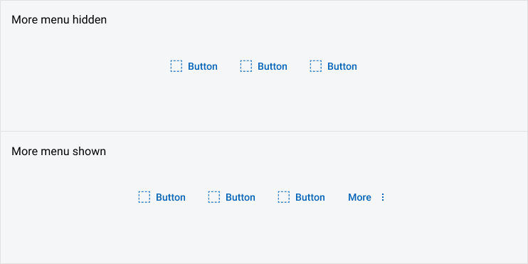
- Action Menu: Users are able to choose how to display their bulk actions using either buttons only or buttons + an action menu. Although most of the users we interviewed only have 1 or 2 bulk actions, some users had 5. Bulk actions often are also in line with other items such as a search bar or a column filter button in the table ribbon. As such, we want to account for a range of items in the table ribbon by offering users flexibility in how they utilize its space with the use of an action menu. This allows users to save horizontal space as well as prioritize actions as “quick actions”, leaving less important actions in the action menu.
- Action Feedback: Users can customize the subsequent behavior once a bulk action is performed. For example, clicking on a bulk action can lead to opening a drawer, opening a confirmation modal, or displaying a success message bar. While through the design system we do not have control over how this is implemented, we provide guidance that users must display a message bar as feedback for the action performed as well as how users should show a confirmation pop up when the action to be performed is “dangerous” (ex. delete).
- Responsiveness: Although most users we interviewed did not express a current need for mobile behavior, as a design system is still important to support responsiveness. As the viewport shrinks, buttons will be automatically moved into the action menu. On mobile screens, the action menu will be an icon only button.
- Accessibility: We also considered the keyboard interaction for tables with bulk actions.
conclusion
- This was the first time I worked simultaneously with engineers throughout the entire design process. I thoroughly enjoyed and prefer this to working pretty much alone when I created the vertical tabs component. Continuous collaboration is key to designing a component that is technically feasible and accessible as well as more efficient since feedback is given in all stages of the design, decreasing the chances of redoing work.
- Flexibility is important for design system components to account for the various use cases and scenarios our users might have.