Business Objective:
- Visually differentiate the listings and price guide pages to decrease user confusion
- Create an easy-to-digest price guide that users with no analytical background can understand
Because WatchCharts is a highly technical product, user with not much statistical or research background may find it difficult to understand the information presented on the model page. As such, we have continuously revamped the watch model page to increase ease of use and user engagement.
In the beginning, we initially validated our improvements with user testing to ensure that primary features and interactions were useful and understandable to users. This also allowed us to better understand the needs and pain points of our users. As we stabilized the basic format and UI design of the model page (Iteration 3) , we began making minor changes in the UI to account for new features. We validated those tweaks through heatmaps in Hotjar to ensure that users interact and are interested these new improvements.
Initial State (March 2020):
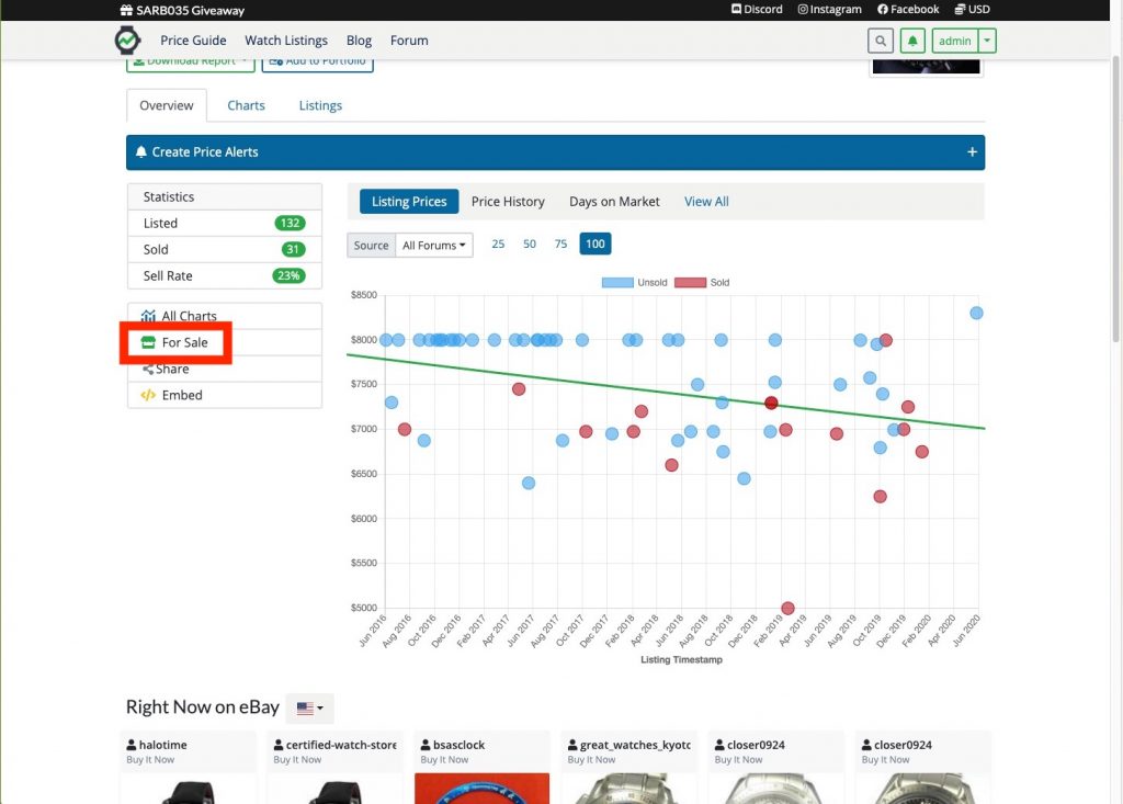
The initial price guide included several charts that analyzed the market as well as relevant listings for that specific watch model .
Problems:
- Whether the graphs were actually useful to users was unclear
- No clear call to action (CTA) to guide where the user should go next
Iteration 1: A New DLS
Improvements / Impact:
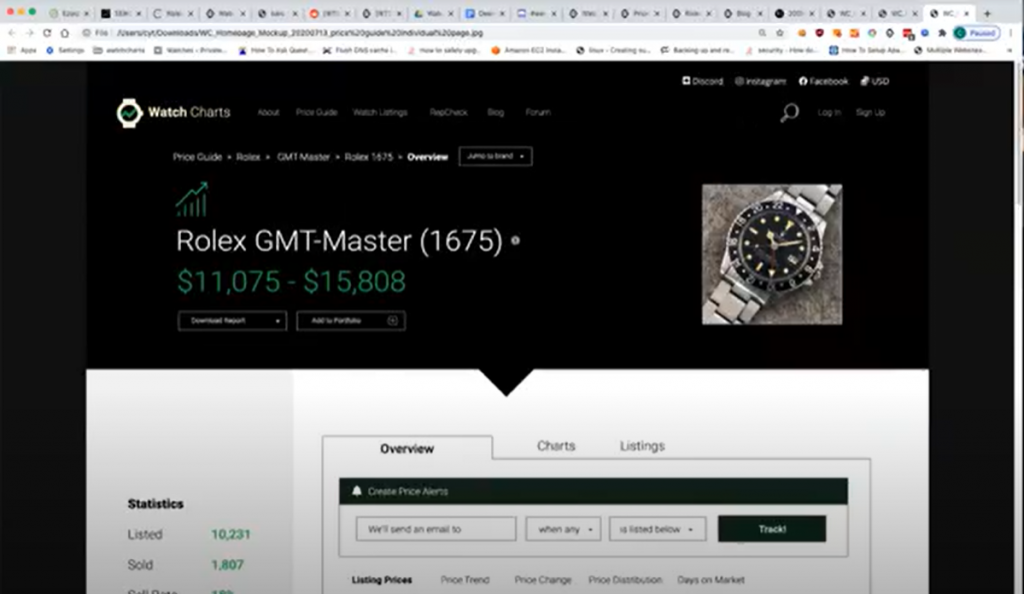
- Implemented a new design language system (DLS) for a more modern and professional UI. Applying a DLS to all aspects of the website streamlined the user experience in terms of look and feel. It also set the foundation for overall branding guidelines for WatchCharts, which we use for the UI of the mobile application and social media graphics.
Iteration 2: A CTA to Listings
Improvements / Impact:
- Added a clear CTA (”Browse Listings” button) to connect model pages to listing pages and enhance the user flow between models and listings.
- Organized sections into tabs in order of relevance and importance to make users more aware of the information presented on the entire page and also make it easier for users to scroll throughout the page

Iteration 3: Cleaner Images, Model Specifications, and Appraisal Tool
Improvements / Impact:
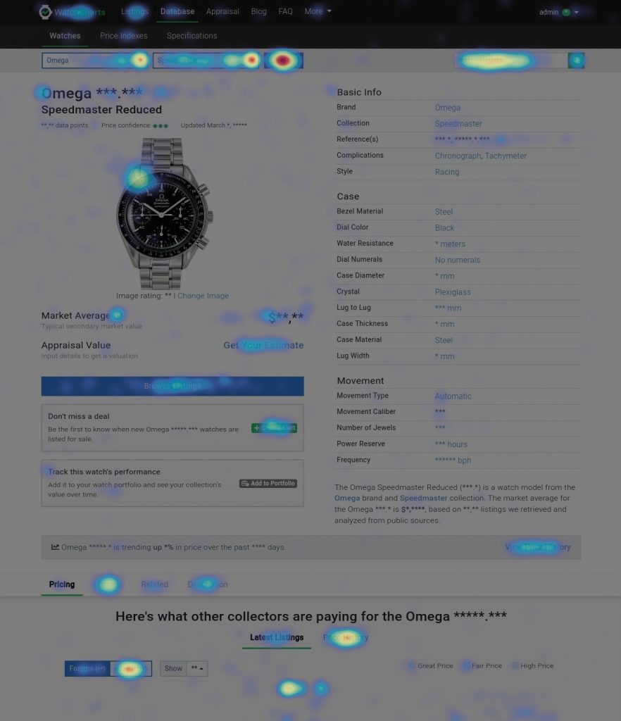
- Clean images with transparent backgrounds were used to further differentiate a model page in the price guide versus a watch listing page. Ideally, these images would be used since the first iteration. However, this improvement was only possible with new machine learning algorithms created by the developers, so time was required before it could be fully implemented.
- A CTA for the new appraisal tool was placed under the market average because both are pricing metrics for a watch model. This also connected the user to the appraisal tool, increasing engagement and exposure of this new feature.
- A list of specifications were added because based on our user research, we learned that aesthetics and specifications were important to users when purchasing a watch.

We used heatmaps from Hotjar to evaluate our redesigns. We noticed that there was some engagement with the new image and appraisal link. Specifications did not receive as many clicks.
Iteration 4: Market Rating
Improvements / Impact:
- A card for market rating was added to highlight the newest feature for the model page. The market rating features a numerical rating and uses green, yellow, and red colors to indicate the watch model’s performance. Using this circular graphic makes the market rating easily recognizable by users not on the model page. The “details” link in the card scrolled the user down the page with more comprehensive information about the market rating, increasing user engagement down the page.
- The list of specifications was shortened to only include the basic information. Based on our previous iteration, we noticed the lack of engagement with the longer list, so we decided to only include the most essential information at the top of the page and add a link that would scroll the user down to the complete list.
The heatmap indicated that users were interested in the market rating and engaging with it by clicking the “Details” link.

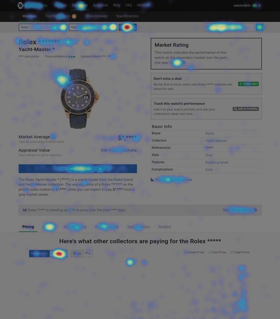
However, as more features were added, the page become longer and 75% users did not scroll past the market ratings section.

Iteration 5: Add The Side Menu for more overall page engagement
- We noticed in Iteration 4 how 75% of users did not scroll past the market rating section of the model page. As such, most users did not see the price history or full list of specifications presented lower on the page. However, we believed that users are interested in this information, especially the price history graph but were not exposed to it because of where it was ordered on the page. We added a side menu to allow users to more conveniently access and scroll between features lower on the page. The side menu also provides a preview of all the information present on this page to the user at first glance.
- We also reordered the page sections in an order that balanced the business objectives to increase engagement in the price history chart as well as the user’s interests and needs.
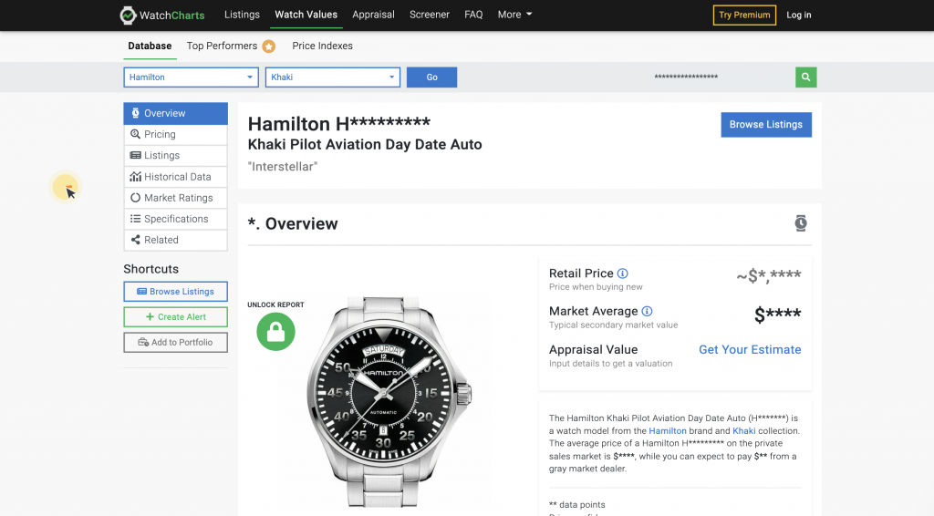
From the heatmap, we validated that users did engage with the side menu.
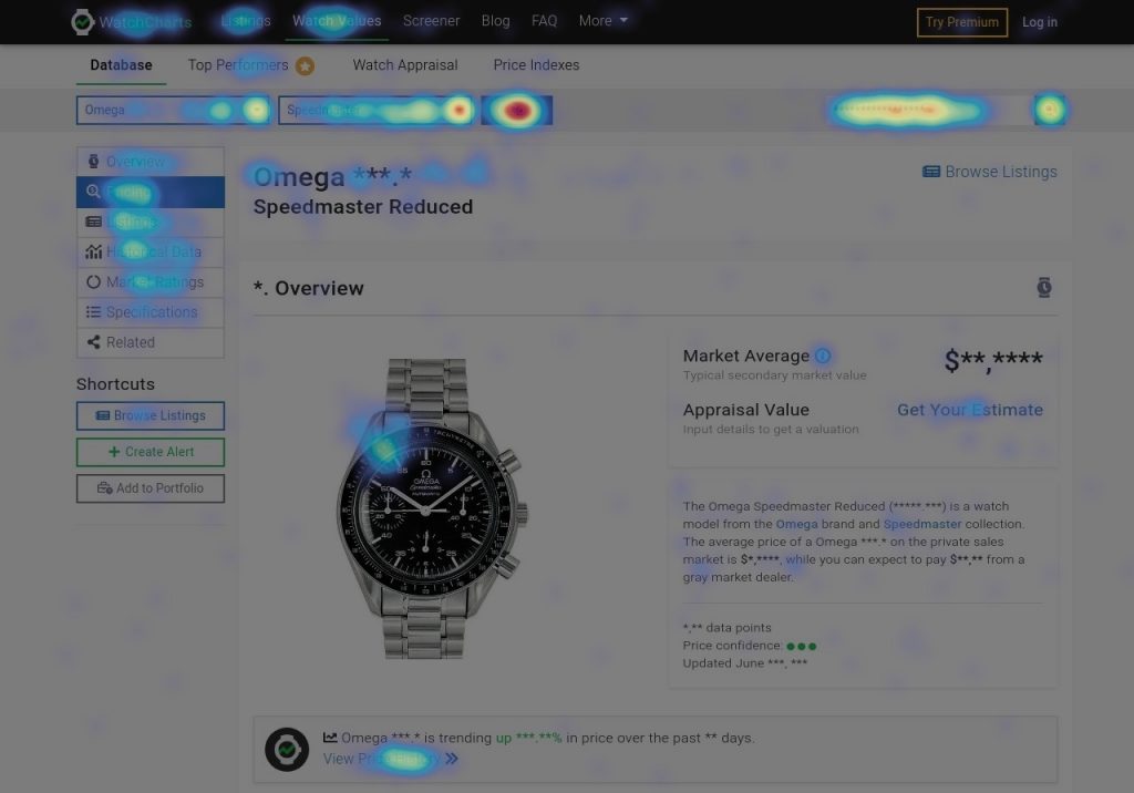
In addition, based on the scroll map, we increased the exposure of the price history graph from below the 25th percentile to above the 25th percentile of scroll depth.


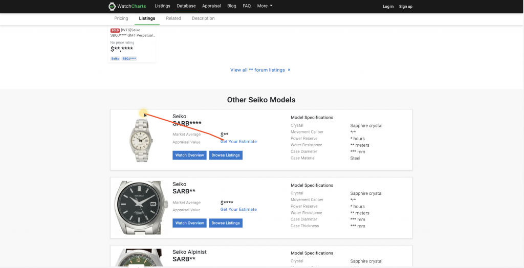
Iteration 6: Redesigned Individual Watch Model Cards
Improvements / Impact –
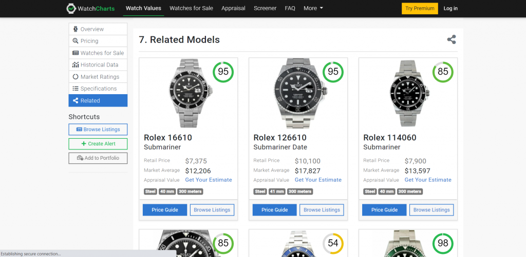
- The market rating was added at the top right of each individual watch model card. This further highlighted the market rating feature as users browse within the price guide.
- The vertical card format allowed the card to be used for both mobile and desktop, streamlining the user experience. The user is also able to see more cards at once.
- The Watch Report and Browse Listing Buttons were redesigned as a primary and secondary CTA, respectively. This decreases the competition for the users attention as to where to click next.
- The list of specifications were shortened into the three badges of the most important specifications users are interested in. This makes it easier for users to quickly scan each card for spec details.
Takeaways:
- Design is a continuous process of iteration and improvement.
- Interdisciplinary thinking is needed for product design. Improvements can be needed in order to fulfill a business objective or to enhance the user experience. A designer must learn to balance both the needs of the business and the user.