Initial State
The Dell Design System (DDS) 2.0 Tabs component only supports horizontal tabs. Users will need to create their own custom classes and functions in order to have vertical tabs. This can be tedious and lead to inconsistencies in style and behavior between Dell products.
Research purpose
We needed to better understand the use cases and desired functionality related to vertical tabs to ensure that our component aligned with our customers’ needs and workflow. More specifically, we wanted to discover how our customers used vertical tabs, such as the behaviors and interactions (ex. sticky), responsiveness, and number of tabs. On the development side, we wanted to gather information that will help us determine if we needed to create any additional event listeners and APIs. This was also an opportunity to audit our existing tabs component and any challenges our users faced when using it.
DISCOVERY
The Process
- Time: ~4 months
- Team: Myself, 1 Designer, 1 Developer
- Role: Designer & Developer
- Competitive Analysis: 6 design systems
- Survey: 26 responses
- User Interviews: 4 groups of designers / engineers
Insights
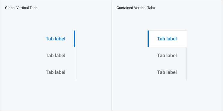
- The behavior between horizontal and vertical tabs was identical; the only difference was the orientation.
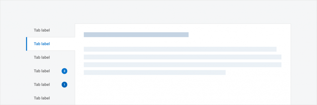
- Users wanted many enhancements to the tabs component beyond just a vertical orientation. For example, they wanted badges, color customization, and interactivity between tabs and another component (ex. tabs in a form).
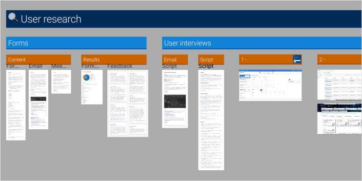
- Many users improperly used the Tabs component. Tabs should organize and divide information of the same hierarchy or theme, however, many users had tabs where maybe a side navigation or action list would be more appropriate. They also liked to use tabs to provide additional information beyond just a tab label.
- Many users had tabs within other tabs (nested tabs).
Framing
Project Scope and MVP
From our discovery, we understood that our users wanted more features for the Tabs Component. However, talking to our project manager, we decided to focus the scope of this project to creating the vertical tabs component rather than enhancing the existing component. As such, we prioritized adding this new vertical orientation that behaved similarly and was styled consistently as the horizontal component. Other feature requests were put in the backlog as further enhancements.
We divided the scope of this story into two main parts:
- Create a new vertical variant of our tabs component
- Create a new “dds__tabs–vertical” class
- Vertical layout for both basic and contained
- Vertical layout should become mobile stacked in smaller screen size
- Create a new variant in Figma for the vertical tabs
- Content update on the DDS website for more guidance
- Adding a do’s and don’ts table for how to use tabs
- Guidance on concise tab titles
- Guidance on when to use tabs vs other navigation patterns
- Guidance to keep tabs accessible
In addition, DDS components should always consider accessibility and internationalization
- Support new keyboard interaction for the vertical orientation based on WCAG guidelines
- Has `aria-orientation` property
- Wraps tab labels that may be short in English but long in another language
Out of Scope:
- Tab enhancements
- Nested tabs – this was determined to be inaccessible design after working with Dell’s Accessibility Center of Excellence
BUILD
Design: Creating a New vertical tabs component in figma
The focus when I created the vertical tabs was to stay consistent with the styling of the existing horizontal tabs component. After discussion with other DDS designers, we decided to create a new vertical tabs component rather than adding a new “orientation” property to the existing component. We made this decision because the existing component contained issues and inefficiencies that would make it difficult to add that property without breaking changes. We would also be creating more inefficiencies by building on the existing inefficiencies. As a result, the new vertical component used newer Figma features such as boolean properties and nested components, allowing me to create a vertical Tabs component with the same features and styles with only 12 variants, whereas the horizontal Tabs component has 70.
Development: Creating a new vertical Class using CSS
Building on the existing tabs component, I created a new CSS class that aligned the tabs vertically. I also altered existing JavaScript logic that automatically inserted a “more” tab that is used for responsiveness on horizontal tabs, because this functionality will not be needed for vertical tabs. Vertical tabs will be responsive by moving into the existing Mobile Stacked variant when the viewport shrinks. See the component in storybook (link)
Customer Validation Interviews
We validated our design with 3 out of the 4 users we originally interviewed and other DDS designers, presenting the design and functionalities of the new vertical tabs component. From their feedback, we confirmed that our current implementation of the vertical orientation fit their needs, however, they requested even more potential enhancements to both the horizontal and vertical tabs.
Iterate
After the first project focusing just on creating a new vertical orientation of the Tabs component, I also made two enhancements.
Rebuilding the tabs component
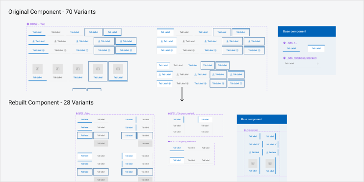
As we initially discovered, the Tabs component in Figma had a vital mistake in the base component and was inefficiently made, making it difficult to maintain and improve upon. As such, we decided to completely rebuild the Tabs component for our UI Kit so that we could not only fix these problems but also include vertical tabs as a “orientation” property as we initially intended.
Before the rebuild, the original tabs component had 70 variants that only accounted for the horizontal tabs. I rebuilt the component using boolean properties and nested components which greatly reduced the number of variants but also makes it easier for DDS designers to maintain and build on for future enhancements. By rebuilding, I was able to reduce the number of variants to 28. This accounted for not only both the horizontal and vertical tabs, but also introduced a new “pressed” state.
In addition, I introduced a new Horizontal Tab Group component and Vertical Tab Group component. These are groups of individual Tabs components that provide users with a readily made set of tabs so that they do not need to align and format it themselves. Users can show/hide tabs depending on the number of tabs they need in a group. These two components make it faster and easier for users to integrate tabs into their work.
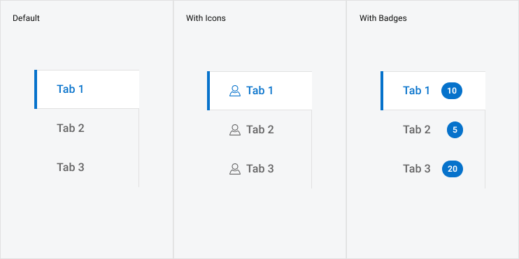
Feature Enhancement: badges
A highly requested feature our users wanted was support for badges. I added the existing DDS Badge component into the tabs component using a boolean property. Depending on the orientation of the tab, the badge will be either center or right aligned.
Conclusion / takeaways
- Breaking changes should not be an inhibitor of better design and progress. Especially for old components like the Tab component, a redesign after many years is beneficial not only to the design system team by creating a more efficient and easier to maintain component, but also to our users by providing them with a better experience when using the component.
- However, breaking changes are still an important consideration for design and development decisions. For example, our content writer suggested renaming our “contained” kind to “contextual” as that is more appropriate. However, we did not do this. While design could implement this, on the development side this would cause breaking changes because our CSS style class name for this variant is tied to the word “contained.” This change would create a need for deprecating the old “contained” class and increase unwanted code bloat to support the new “contextual” class.
- While listening to customer requests and needs is important, it is also just as vital to consider the limitations in time, resources, and business needs. After our discovery, we started to experience scope creep with all the enhancements our users suggested. As such, between the project manager, designers, and developers, we decided that the scope of our project should primarily focus on creating this new vertical orientation, only later to add new features like badges.