The Research Purpose:
From our previous research, we redesigned the webflow and user interface of WatchCharts. We conducted five user interviews with WatchCharts users to validate whether our redesign achieved our intended goals. We interviewed users with ranging watch collecting backgrounds to understand how useful and understandable certain features on WatchCharts were. Users also varied in familiarity with WatchCharts in order to gain perspectives of how well existing users could adapt to the new interface as well as how easily new users could navigate the site for the first time.
The Goals of the Redesign:
- Convert more people who are looking at listings to look at the price guide
- Higher conversion for account and alert creation
Hypotheses:
- Changing the homepage to the listing page will encourage more discovery on watchcharts.
- Possible cons: people may not know what exactly watchcharts does
- Pulling out the pricing tab will get more people to notice the research and data that watchcharts offers, showing them of the research that they could possibly do on their watches (which they didn’t know they could do this before) and encouraging them to research in this new way
- Possible cons: possible confusion of what the information means or how it relates to the specific listing
- Because people don’t have the mental model of listings vs. models, we focus on the flow of listing page to model homepage, clearly stating on the listing page that the information is market data, in order to let people know that the model homepage is NOT another listing page.
- Possible cons: people still think that the model homepage is another listing page, making them confused if the number changes (listing price vs. market average)
The Process:
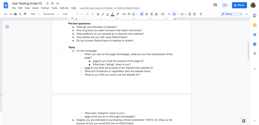
User interviews were divided in two main parts: 1) basic questions to understand the user’s watch collecting background, and 2) tasks to observe how the user interacted with specific pages or elements on WatchCharts
In addition to desktop, we also asked users to view the site in tablet and mobile to compare and understand the experience across different screen sizes.
Takeaways:
After each user session, we discussed our observations and came up with these insights:
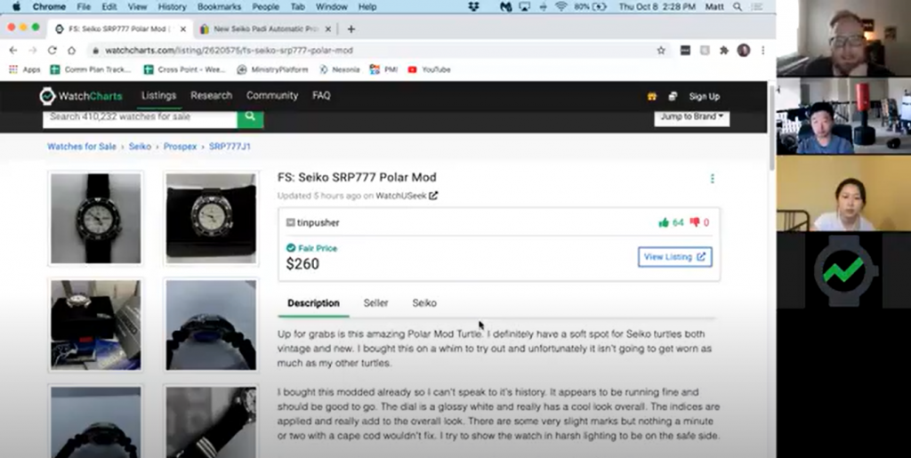
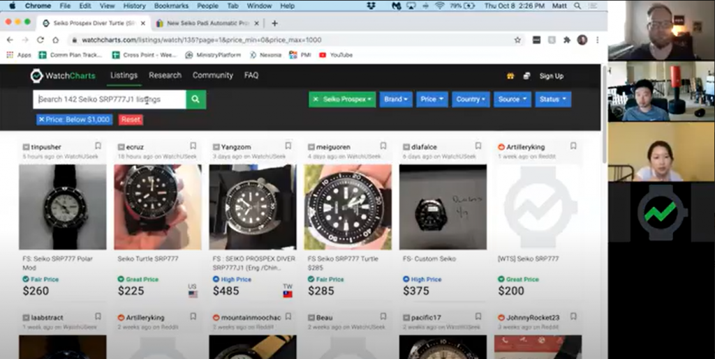
- Users preferred to begin their research from the listing page versus searching a watch model directly through the price guide.
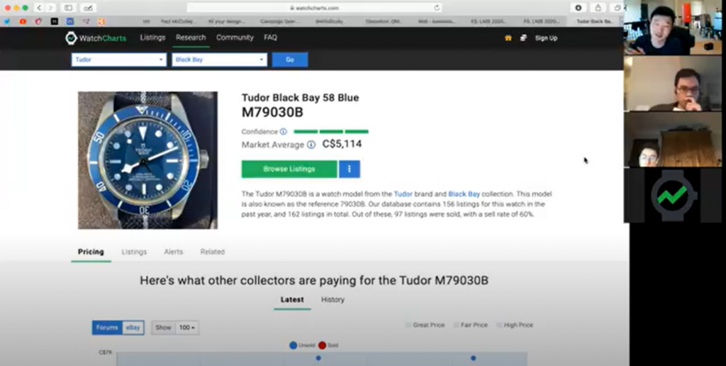
- The scatterplot was the most useful chart for users compared to the price distribution and price history graphs
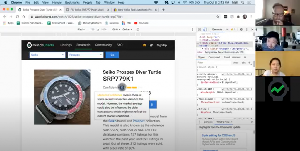
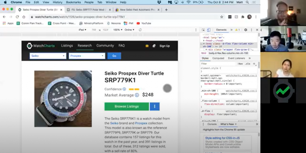
- When asked to test specific features like the price alert or the price confidence, most users understood how to use it or the information presented. However, at first glance, users may find WatchCharts to be confusing, overwhelming, or unapproachable because it is a highly technical product.
- Although users may not have the exact vocabulary that differentiates listings vs. models, most users are aware that the model page is not a listing page.
Next Steps
These insights directed our next steps in improving the UI of the website, including removing the price distribution graph and refining the copy for the price confidence description.
In addition to user interviews, we have continuously improved the listing and model pages utilizing tools like hotjar to evaluate the user experience.