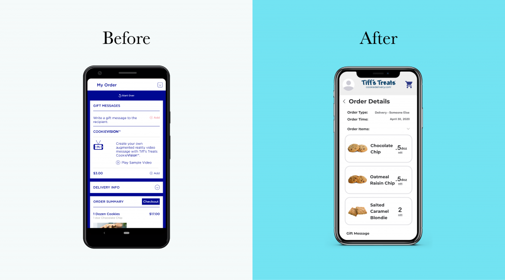
Overview
Role: UX Design, UX Research
Tools: Adobe XD
Duration: ~ 1 month
Background
As a UT student, I experienced no shortage of Tiff’s. There were always free cookies being passed out somewhere on campus. Although I had eaten Tiff’s cookies firsthand and knew about their cookie delivery service, I was still anxious when I placed my first online order from my studio in Chicago for Father’s Day for my dad in Dallas. I found the ordering experience confusing. There are so many forms to fill out before I can get to actually choosing which cookies I want to order. Why do I have to schedule my order and put in my address before looking at the menu? As such, this case study addresses the issues I faced as I redesigned Tiff’s mobile app experience and design.
Research
User Research
I created the following persona as a guide as to what types of users my redesign would cater to:
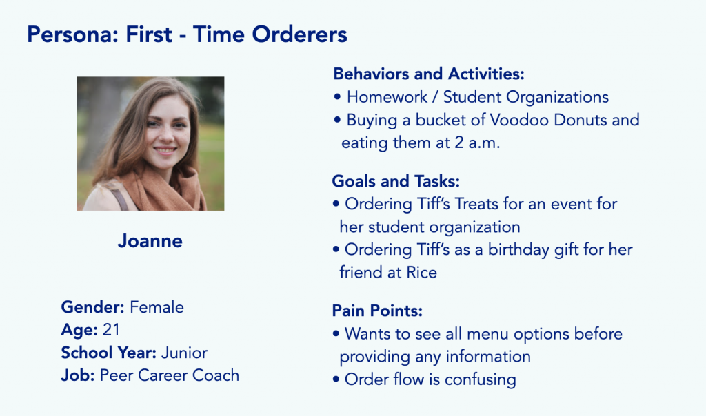
In addition, I gathered these valuable insights:
- Many people who eat Tiff’s for the first time are not the ones who bought it.
- Many people know about Tiff’s, but do not order it themselves because it is too expensive.
- Ordering and receiving Tiff’s is most appropriate for celebratory, motivational, or special occasions.
Market Research – Competitors

Insomnia Cookies
A direct competitor of Tiff’s Treats is another cookie delivery business, Insomnia Cookies. In the mobile app, users must first enter their location before viewing the menu items. This step can be quick as the app uses location services. From there, users can go between the order, my account, location, loyalty, and cart tabs. While entering your location may be somewhat unexpected compared to a traditional online ecommerce service, this step is largely quick and easy that users may not be as bothered by it.

Instacart
Instacart is an online grocery delivery service for large stores like Target and Central Market. Its concept as a food delivery service is similar to Tiff’s Treats, although it encompasses a large range of products outside of cookies or desserts. With Instacart, customers can browse all items and save it into their cart until they are ready to purchase it. I consider the online shopping experience from a site like Instacart to be what most Tiff’s users would be used to and expect from other online delivery experiences. As such, I believe it is appropriate to model the order flow for Tiff’s Treats after Instacart’s.
Problem
How might we streamline the ordering process for first time Tiff’s orderers?
Concept
A More Intuitive Order Flow
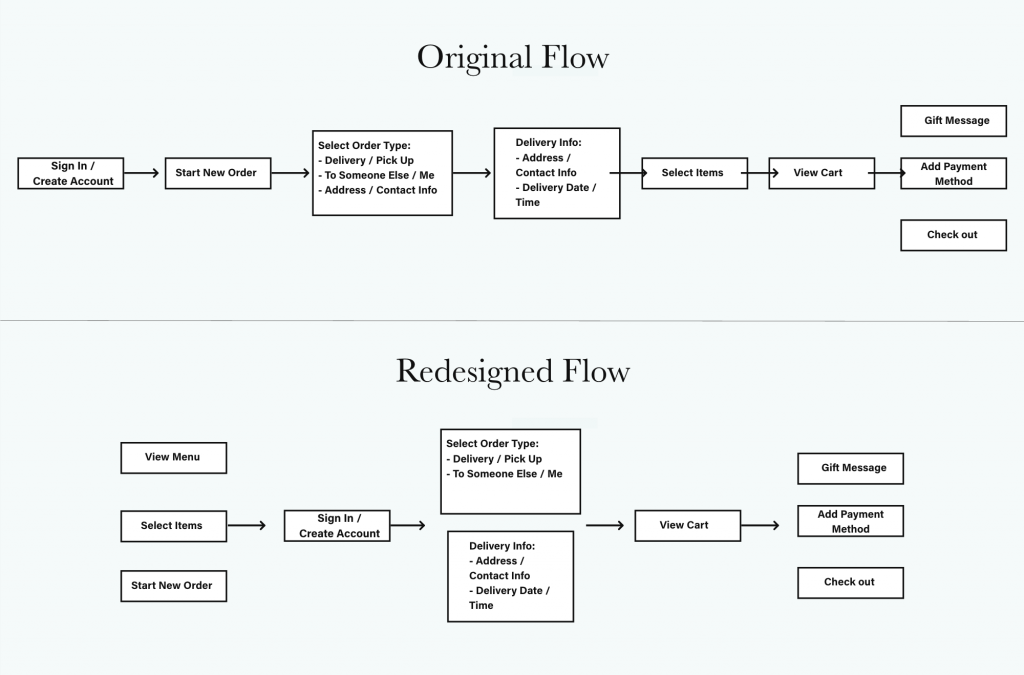
Original
The original order flow is unintuitive because users must fill in their order and contact information before being able to “Select Treats.” Furthermore, mobile app users must first create an account or sign in before viewing any other pages. This is especially irritating for a first-time orderer such as Joanne (described above), who wants to know all the cookie options she could possibly try as an adventurous foodie. Requiring first-time users to create an account and take time to enter information when all they want to do is look at the menu is a frustrating experience.
Another case in which Joanne may face issues is when she hopes to order Tiff’s for an upcoming event for her student organization. As the event planning is still in progress, Joanne may know the date of the event, but does not have the logistical details as to what time and location the cookies should be delivered. By prioritizing “Delivery Details” and “Schedule Order” before “Select Treats,” Joanne must either take time to put in a fake time and address in order to view the menu, or just give up on the task until after she has these details.
Redesign
As a foodie, Joanne likes to view all her options before deciding what exactly she wants to order. As such, this new order flow prioritizes viewing the menu (“Select Treats”) prior to entering other contact and order information. This order flow is also more intuitive because this is what users are familiar with, modeled after the order flow of popular online food delivery sites such as Instacart.
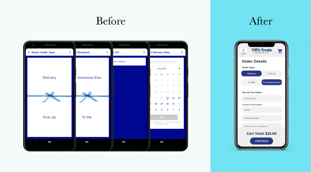
In addition, this redesign consolidates step two into one order form rather than four separate forms. This reduces the number of clicks users must do in order to enter this information, as well as streamline the process to be quicker.
UI Redesign
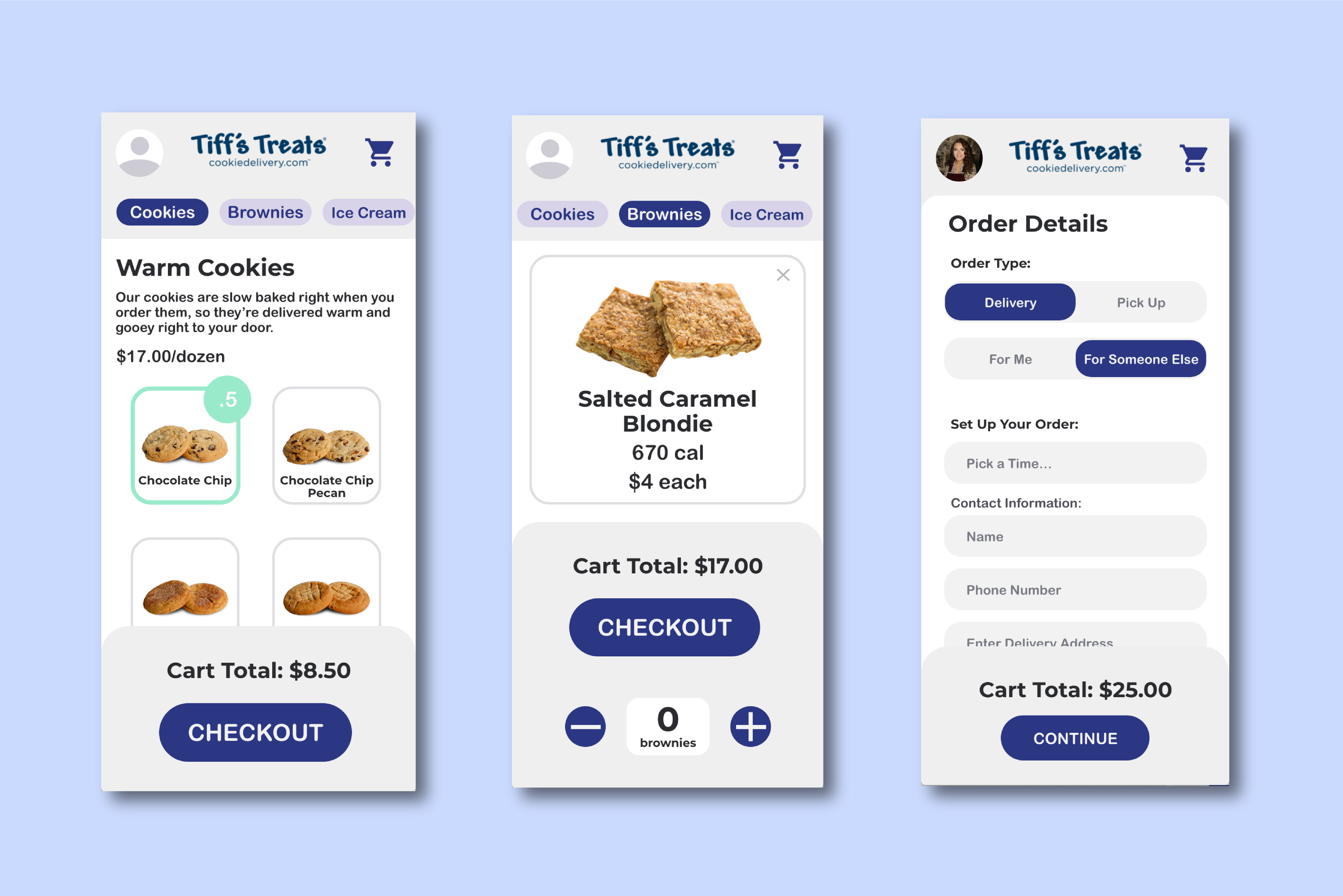
In addition to a more intuitive and streamlined order flow, I redesigned the mobile UI to be more soft and minimal with clear CTAs on each page.
Consolidated Order Forms
I consolidated the information input forms, originally taking up four screens, into one form to streamline the order process.
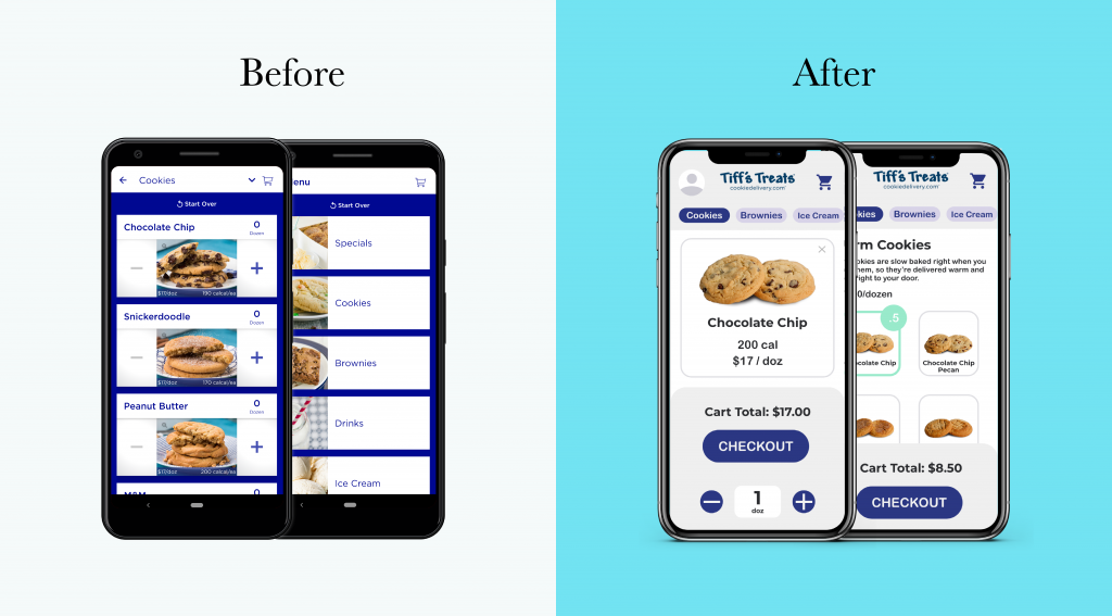
Order Menu
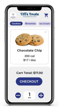
I created the affordance to expand each menu item to more clearly view details about calorie count and price.
Check Out Form
With a more clean and minimal visual design, customers can easily view the order and payment details before checking out.
Select Menu Items https://alicetian.com/blog/wp-content/uploads/2020/07/Tiff's%20Demo%201.mp4
Consolidate Order Formhttps://alicetian.com/blog/wp-content/uploads/2020/07/Tiff's%20Demo%202.mp4View Cart & Start Checkouthttps://alicetian.com/blog/wp-content/uploads/2020/07/Tiff's%20Demo%20View%20Cart.mp4
Order Check Outhttps://alicetian.com/blog/wp-content/uploads/2020/07/Tiff's%20Demo%203.mp4
Final Thoughts
As my very first individual case study, this redesign allowed me creative freedom in designing the mobile UI as I prefer. I gained experience in using some very convenient and time-saving features such as component states and color and font assets, which created consistency between mobile pages. I also used magic motion to animate many of my pages for the first time, and these gave more interesting animated effects, such as the bouncing out effect of the plus and minus symbol buttons.
From a research perspective, I was able to combine both my UX research knowledge from previous projects as well as my business experience in market analysis. From my previous multifunctional calendar project, I learned how to create a persona and create a solution based on their specific needs. In addition, my market research gave me insight as to what users may expect from their mobile shopping experience based on industry standards. As such, I was able to determine not only what users like my persona needs, but also how to best present those needs.
