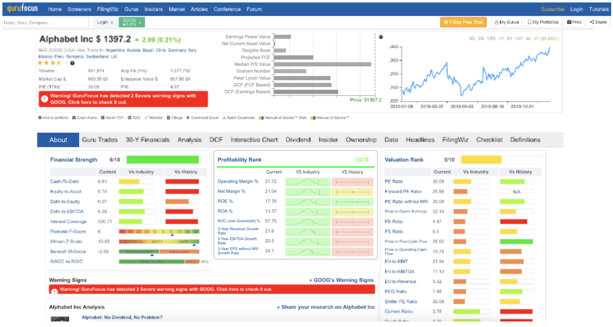
As a value investing research platform, GuruFocus offers an exhaustive and comprehensive amount of information for investors. Although useful, the information is presented in a manner that is cluttered and hard to read, hindering the research experience for all users, and especially new users.
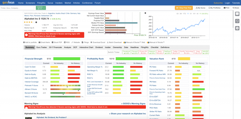
Purpose: Improve the readability of the GuruFocus Stock Page
As such, I decided to redesign specifically the GuruFocus Stock Page. To achieve this, I focused primarily on:
- Visual hierarchy within sections
- Practical use of colors
- Visual hierarchy between sections
- Naming and consistency
Visual Hierarchy Within Sections
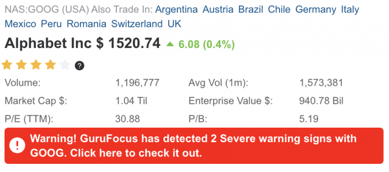
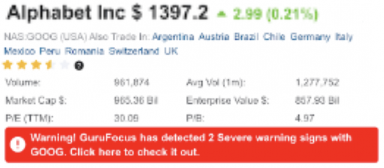
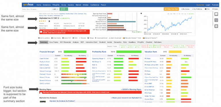
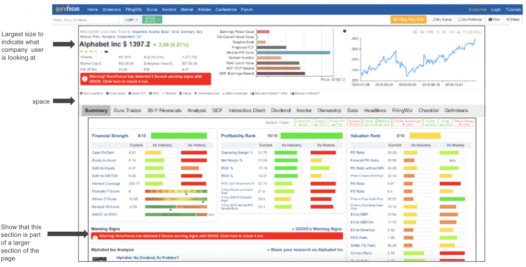
Based on the F or Z-shaped pattern for reading, the section below is the first thing users will see when landing on the stock page. Naturally, I believe that the company name should be at the top of the section so the name is the first thing users read to indicate which company’s stock page they are on. The type size could also be enlarged to stand out from the rest of the information in this section.
Practical Use of Colors
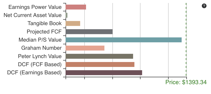
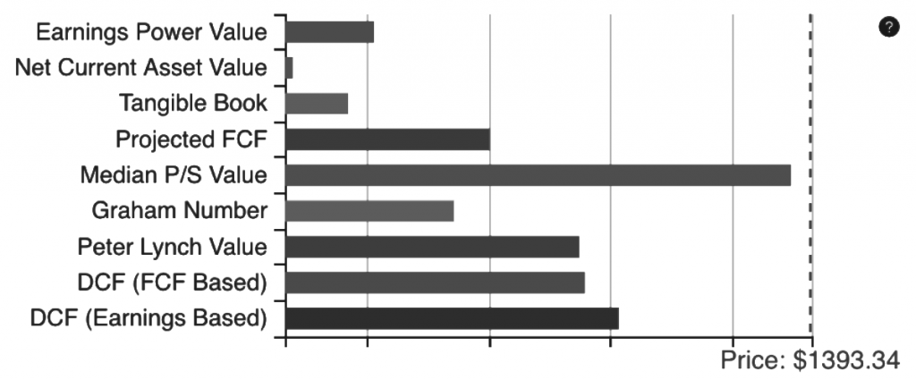
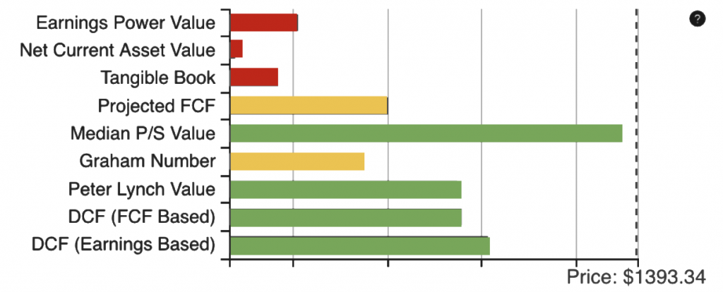
The varying colors used on the GuruFocus Stock Page created unwanted and meaningless noise. For example, while the red, yellow, and red is useful in indicating the status of the company’s financial strength and profitability, etc. However, the colors used in the ratio chart at the top center of the page provides no extra information and also does not match the color scheme of the page. As such, I propose to either remove the color from the chart or use colors to indicate additional information about the ratios. For example, if the earnings power value of the stock is low, it could be shown with a red color.
Visual Hierarchy Between Sections
The Stock Page presents a large amount of information, however, the information is squished together. To improve visual hierarchy between sections, I added spacing around the page navigation bar to spread the sections apart.
Naming and Consistency
In addition, I recommend changing the name of the tab, “Summary,” to “About.” The reasoning behind this is because the information presented at the top directly underneath the company name seemed more like a summary. In addition, “summary” makes me think that the section should be concise and only about the main points, such as a blurb about the company. However, the summary tab is extremely long and provides comprehensive information. I believe that “About” is a better name for the first navigation tab.

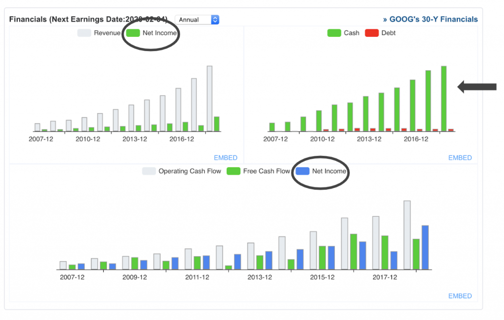
Color consistency is an issue between the two graphs as net income is represented with green in the top left but represented with blue in the bottom graph. In addition, the green and red has been consistently used to represent good / bad throughout the page, and this continues for the top right graph. However, the same shade of green is used in the other two graphs, but the green is not used to indicate good.
GuruFocus Stock Page – After
From these suggestions, I recreated the GuruFocus Stock Page to improve readability using Keynote:

